Last semester I was having difficulty finding an internship, I just didn’t have the right balance of prior experience and competitive advantage. I knew a little bit of a lot of disciplines but nothing that made me stand out. Or who knows, maybe I just got unlucky. One day though, I was browsing the CU job board and came across a position: Arctic Researcher. As an aerospace student, I wasn’t super thrilled about environmental science, but I said why not and applied. While I ended up with a position at the Institute of Arctic and Alpine Research, under Detlev Helmig in the Atmospheric Research Lab. More than the idea of having a summer internship though, I found a passion for data science and visualization and have been given an incredible glimpse into the world of environmental research.

My work started on the Global Atmospheric VOC Monitoring Program, specifically working with the data from Summit, Greenland. My primary responsibility was ensuring that the Summit GC returns quality data with an hourly time resolution. I checked atmospheric data using PeakSimple and got a little hands on experience with gas chromatography, which was surprisingly interesting. The first major task I had was creating a public outreach website for the data. I made all the structure and design, and my manager Brendan Blanchard made an automated processor to update the graphs every 30 minutes or so. Beyond this, I got the chance to do some lab work with setting up and extracting measurements on NOAA gas flasks from the larger VOC program.
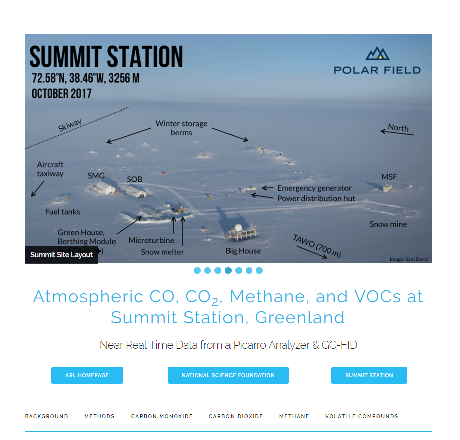
http://instaar.colorado.edu/arl/summit/summit.html
In parallel to the day to day data science work, I completed a UROP grant over the summer. I analyzed ethane/methane and acetylene/methane ratios, and created time series of these two ratios over past years. Then I identified the overlap of back trajectories with fire counts from NASA satellite products, observing where they cross the pollution plume events. This project opened my eyes to how intriguing this research really was, even at the basic level that I was doing it at. I was tracking atmospheric measurements of gas backwards in time using meteorological data, something I didn’t even know was possible. Using it to match fires was just as amazing, trying to come up with matching algorithms, and performing sensitivity analyses to find the best combination of parameters. I also gained experience in cleaning and trimming datasets, arguably the hardest part of the job. It takes a significant amount of time to get the dataset to the point where it’s nice and easy to form conclusions or make plots. There’s also harder data removal, like analyzing wind patterns to identify sources of local machinery pollution at the collection site.

Beyond all the research, dataframes, trimming and cleaning, and just hard python coding, my favorite thing was making visualizations. I can’t tell you the number of times I went home to my roommates and said: “Hey, you gotta see this plot I made today man.” They probably got sick of it, but I had so much fun making gorgeous visualizations to present my data easily to anyone. Even my artist parents could easily understand the data when I put it in graphs, and I probably got some of my interest in this from that same art skill! Below is the final graph I made for my research. It took me forever to figure out how to make the globe, reading about all sorts of map projections, cartographic line patterns, public assess background maps, and coordinate systems. But the end product… well, it speaks for itself:

https://github.com/JashanChopra/SummitWildFireTracers
Overall, I had an incredible summer at INSTAAR, and I plan to have an even better next two semesters working in the lab. Luckily, only a five minute bike from my house! I’ve moved on from the Summit project, and I’m starting to work on data analysis for the Boulder Reservoir. This local project has much greater implications and responsibilities. Hundreds of people visit the website to see our live data everyday, and many researchers depend on our analyses for their own considerations. The oil and gas industry in the Front Range has plenty of environmental challenges and quotas that they’ve failed to meet, and people are directly affected. Hopefully by putting pressure on them through scientific analyses we can save lives, even from our little atmospheric lab. Having the chance to do this meaningful work so early in my career has been a blessing that I won’t forget!